Wednesday, 4 June 2014

Contemporary beehive


The bees were moved to the honeycomb-inspired structure after they were discovered living in an abandoned and decaying grain mill nearby. The gorgeous Elevator B is a suitable new home for the thriving colony. The gleaming hexagon-paned tower was created by four architecture students, Courtney Creenan, Scott Selin, Lisa Stern, Daniel Nead, and Kyle Mastalinski in a contest organized by UB’s Ecological Practices Research Group. The contest asked the students to create a living structure – one that the bees could live in that would help them continue to thrive amidst the city. The structure was also commissioned to educate the public on the importance of bees, and their role in our ecological system.

Elevator B gently mimics the long-abandoned silos that sit on the land on Buffalo’s waterfront, where the bee colony was found. The glittering structure rises twenty-two feet, and it stands freely on the silo city grounds. The framework of hexagonal shapes allows the bees to freely live and build just as they did in the similarly shaped grain silos adjacent to the new tower.


After completion, the bees were carefully moved from their dilapidated home, into Elevator B. Visitors can enter the tower, and look up to watch the hive’s activity with a moveable glass window.The window can be lowered by a trained beekeeper, who will check on the bees to ensure the health of the hive. The tower will also insulate and warm the bees in the harsh Buffalo winters.

As a reward for their labor, the honey from the original grain silo hive was pressed and shared amongst the designers and builders of the new hive.

Thought for the day...


Thursday, 30 January 2014

Fav new shop ...

Goodhood Store - Shoreditch.

Don't you love when you get lost and then find something amazing. Wondering around shoreditch fell across this new shop. Check out the new Goodhood interior shop. Goodhood , who are known for their fantastic range of clothing are now branching out to the interior market. Bit annoyed they've done my idea for a shop concept but a great collection of goodies.


Cool shop design


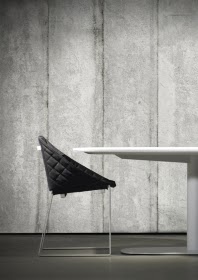
Concrete trend - bad for the planet but I have a solution.


As we all can see concrete is everywhere.From kitchen tops, bathrooms and interiors. Problem !?! concrete it is very bad for the environment. Surely we have learned by now that we need to improve our affect on this earth - our carbon footprint, I have a solution for you to ethically follow this trend. 

I don't normally go for fake products but a 'eco' way to follow this trend would be these fantastic award winning wallpapers by NLXL.


NLXL was founded in the Netherlands in november 2010 by Rick and Esther Vintage. The company focusses on premium quality wallpaper. NLXL is known for the Scrapwood Wallpaper collection, brainchild of designer Piet Hein Eek and NLXL founder Rick Vintage. This collection won the Editor’s award at ICFF New York in 2011 and can be found in the permanent collection of Smithsonian Cooper-Hewitt Museum. Recently the company introduced the “Brooklyn Tins” wallpaper collection for Paris based concept store “Merci” and “Concrete Wallpaper” by Piet Boon®. The latest collection is “Remixed. Wallpaper by Arthur Slenk”. In august 2013 two more collection will follow. The collections are available at more than 2500 resellers worldwide.

Art meets sculpture


I came across Celia's Beautiful work when she took part in artists in residents which took part in the Fritz Hansen London store. Such attention to detail. her unique use of wire really makes her sculptures come alive.     


"I use wire to create sculptures. Each sculpture that I make is a three-dimensional drawing with the wires representing a quality of line. Birds are my main inspiration; capturing their movement and character is my primary concern. I find that wire has a spontaneity that can give my sculptures a feeling of life and energy."